25 May 2023
Furnishing with colours: how best to do it, what are the trends and the mistakes to avoid
Colours play a key role when it comes to furnishing a home, as they influence the style and atmosphere of the surroundings. Choosing the right tones can make the difference between an anonymous home and one that conveys personality and style. But how do you make the most of colour in your home?
In this article, we will give you valuable tips on how to decorate with colour and show you current trends to make your home even more welcoming and modern. Let's discover together how to transform your home into a unique and personal environment by choosing the right colours.
The latest colour trends
In recent years, colours for interior design have become increasingly important. This year, colour trends focus on natural and neutral colours, but also on bolder and more vibrant tones, skilfully combined to create a sense of balance and well-being.
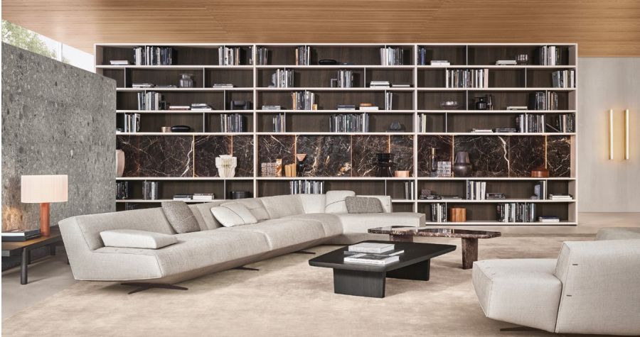
Think of the furniture proposed, for example, by Cattelan Italia, a brand that aims to return to an industrial, elegant style, but with character and timeless beauty. The dominant colours are those of metal and brass, but also anthracite, marble and neutral tones that adapt to any environment, outdoors or indoors, creating elegant and surprising shades.
Among the most popular and widely used colours are green, which evokes nature and tranquillity, blue, which conveys serenity and harmony, and pink, which gives a touch of romanticism and femininity to rooms. But black, grey and beige are also still widely used for their elegance and sobriety.
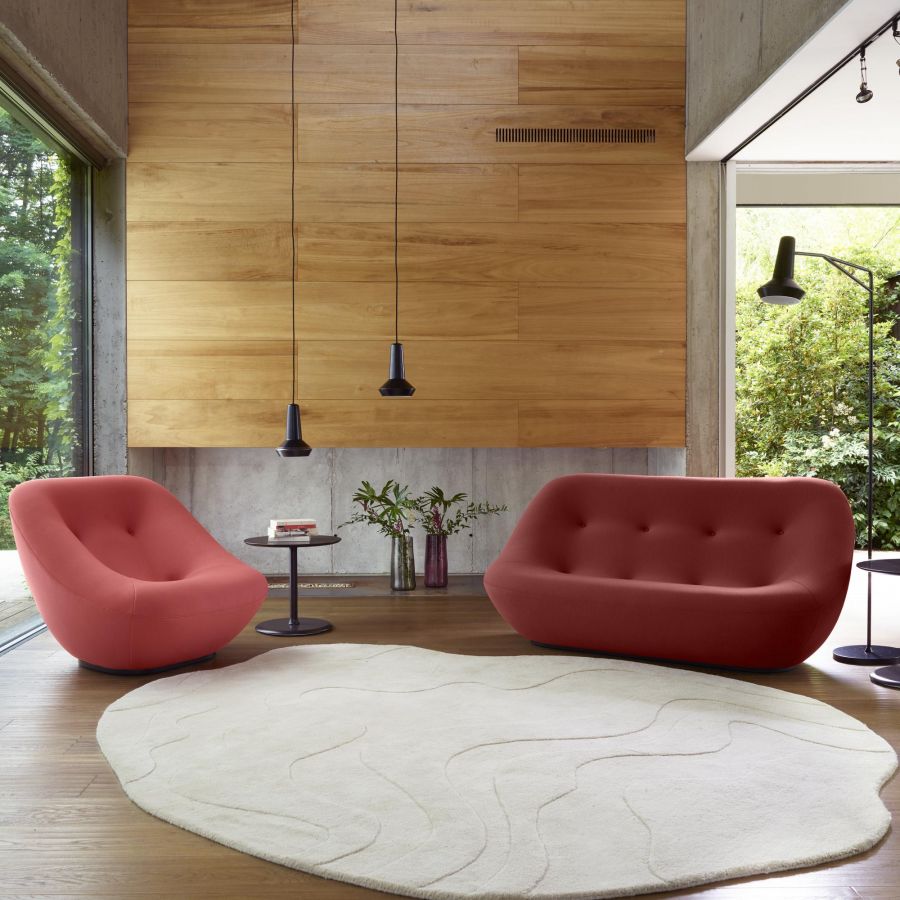
The boldest and most vibrant tones are yellow, red and orange, which bring energy and vitality to spaces. The desire to communicate passion and enthusiasm is strong, which contrasts with the minimalism and design of more modern homes. People are looking for aesthetic and Instagrammable solutions that are beautiful to look at, but also clean and tidy.
Edra is a furniture brand that makes colour its strong point. Its solutions are very lively, dynamic and know how to attract attention. Of course, there is no shortage of more discreet and neutral proposals, but the brand likes to play with colours, contrasts and the reproduction of shades on different materials, and these experiments are highly appreciated in the world of designer furniture.
For maximum effect, these colours can be combined with each other, creating balanced chromatic harmonies. For example, green can be combined with beige or white to create a relaxing, natural ambience, while pink and grey can be combined to create a sophisticated, modern effect.
Mistakes to avoid when choosing colours
Furnishing with colour is an art. Choosing the right tones and mixing them in a balanced way can create an extraordinary space full of life. However, when you don't pay attention to the details, it is easy to fall into some of the most common mistakes that can ruin the whole project.
The first mistake is to combine too many different shades. It's easy to get carried away with the wide range of colours available, but the end result can be confusing and messy. The rule of thumb is to choose a maximum of three main colours and use them in a balanced way, respecting the palettes.
Another common mistake is the overuse of bright colours. These colours can be great when used sparingly, but if used too often they can be distracting and overwhelm the space. They are best used as accents or in small quantities.
Finally, it is easy to fall into the trap of choosing colours that do not fit in with the rest of the décor. The choice of colours should be made strategically and with the environment in mind. It is important to pay attention to wall tones, fabrics and existing furnishings to create a perfect harmony.
How to use colours creatively
Choosing the right colours for each room in the home is not only a matter of personal taste, but also of creating the desired atmosphere and making the best use of the available space. Colour affects both the furnishings and the walls, but also other elements of the room that are not obvious at first glance, such as light.
If the area receives little natural light, it is best to opt for light, bright colours that reflect the light and create a cosy atmosphere. On the other hand, if the room receives a lot of natural light, you can go for darker, more intense colours.
Poliform, for example, is a furniture brand that plays a lot with light and dark colours. Some of its proposals for furnishing all the rooms in the house are in intense colours, which make the room a more formal and elegant space, with a touch of mystery and seriousness. On the other hand, there is no shortage of lighter and brighter colours that adapt to any room, even the darkest ones.
If the space is small, it is advisable to avoid using too many different tones and opt for neutral colours, which give a feeling of spaciousness and luminosity. On the other hand, if the room is large, you can go for bright and vibrant colours, which create a dynamic and stimulating atmosphere.
Here are some perfect colour combinations to create the desired atmosphere:
- Black and white: perfect for creating an elegant, minimalist atmosphere.
- Pastel shades: ideal for creating a romantic and relaxing atmosphere.
- Blue and grey: for a serene and relaxing effect.
- Red and orange: for a dynamic and stimulating atmosphere.
- Green and yellow: ideal for creating a fresh and invigorating atmosphere.
And once you have chosen your colours, how can you combine them creatively?
First of all, it is good to create balance, you can combine bright colours for the walls and more neutral ones for the furniture, taking into account textures and shades, but also styles. Eccentric walls cannot be combined with industrial furniture, while a vintage style often contrasts too much with modern and innovative fabrics. Each element should blend perfectly with the others and avoid an alienating effect.
To create a sense of depth and movement, you can opt for a colour shading technique on the walls. By using different shades of the same colour or complementary colours within the room, you can create a surprising and dynamic chromatic effect.
Finally, it is good to choose colours according to the feeling you want to convey: formality with cool tones, comfort and cosiness with pastel colours, energy with vitamin tones or seriousness with dark tones. There are no rules, except balance and elegance. Take a look at our e-commerce: the best interior design brands will inspire you.